|
This might feel like a math lesson but hang in there. The golden ratio combines a little bit of math, a little bit of nature, and a lot of practical application for designers. Let’s take a look at what the golden ratio means for design, and a few tips for using it in your design projects. The golden ratio has been used throughout history to create design elements that have an ideal visual appeal. Because the shape is rooted in nature and mathematics, it’s the perfect combination of balance and harmony. And it’s a superb tool to have up your sleeve as a designer. What Is the Golden Ratio?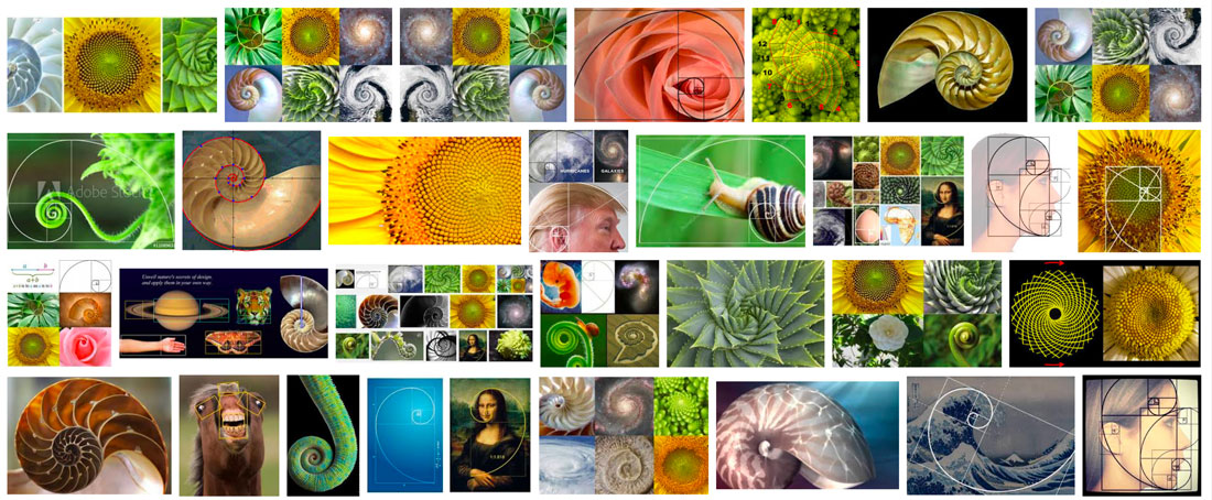 Simply, the golden ratio (also called the golden rectangle and golden mean) is a shape with a proportion of 1 to 1.618. More complexly, the math can be described like this as explained by the Interaction Design Foundation:
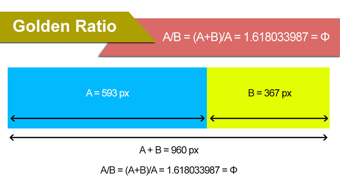 Mathematically calculate the ratio using the formula for Phi: A/B = (A+B)/A = 1.618033987 = Φ The applications for print and web design projects are often less precise than that 1 to 1.618. Many designers will round numbers when creating a mathematic golden ratio for grids that are easier to work with. When it comes to applying the concept, it’s often represented using a spiral, circles or triangles. And it’s not “just a design thing.” The golden ratio is found in nature (nautilus shell), art (the Mona Lisa), architecture (the Eiffel Tower) as well as design. How Do You Use It?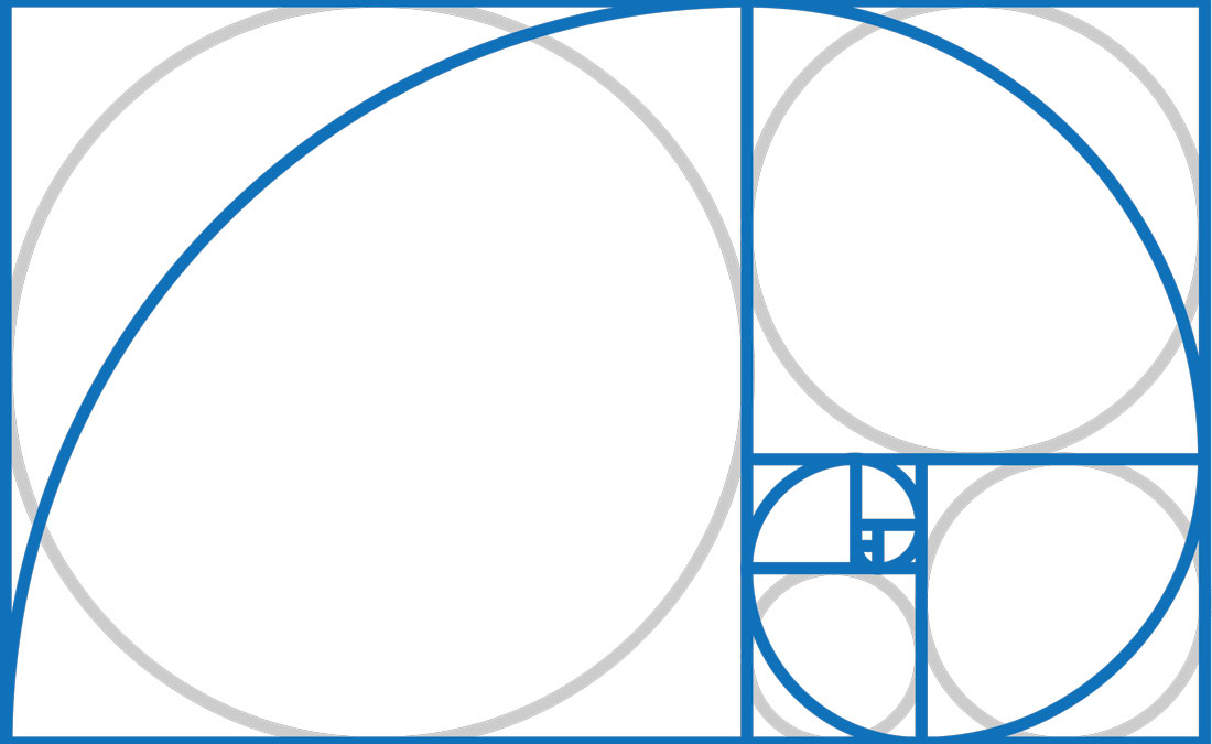 When it comes to applying the golden ratio there are different schools of thought:
The best solution might be somewhere in the middle. In all likelihood, your eye is probably trained to create and lean toward designs that include this theory, but it can never hurt to see if you are actually applying it well. And the canvas can cause all kinds of issues when it comes to the golden ratio. You don’t know what browser size someone might use or the ratio might not fall in line with a specific print size. The goal is to create parts within the design that fit this ideal shape. Consider it for a logo or photo crop. Use it to create a header or a certain piece of a design. Use the concepts to create a base grid or hierarchical scale for typography. Grids and Templates If you are anything like me, the idea of complex math to solve a design problem is a little intimidating. There’s where having some great tools can help. Here are some templates and calculators to make using the golden ratio a little easier. 3 Tips for Using the Golden RatioSo how do you put all of this information into practical use? (We don’t want you to overthink design projects and get overwhelmed by math.) Here are three tips for using the golden ratio in design projects.
Why Does the Golden Ratio Matter in Design?So why does the golden ratio really matter to designers? It’s one more tool to help you create something that establishes the right emotional and visual tone with users. This theory exists whether you apply it intentionally or not. So what matters is that you understand and acknowledge it in an effort to create the best and most usable design possible. What the golden ratio does is cue you into to focal areas where the user is likely to focus and look based on nature. It helps create balance and scale, even when not wholly intentional. Here are a few well-designed websites with the golden ratio template overlaid on them to see exactly how it relates to the individual designs. 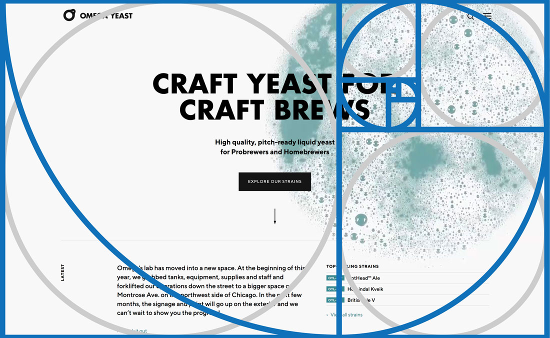 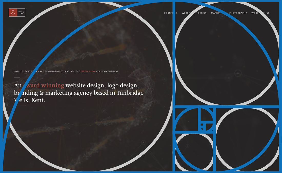 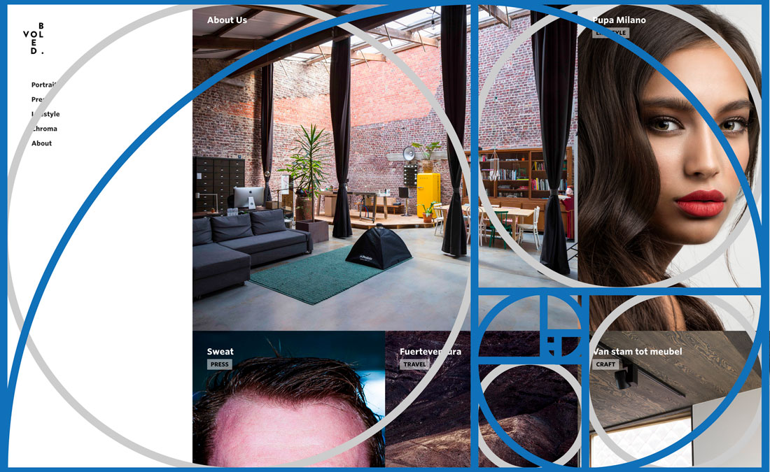 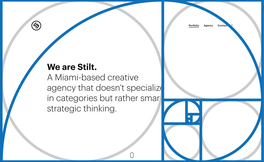  ConclusionSo here’s your key to understanding and using the golden ratio: It’s there whether you think about it or not. So why not consider how this time-tested design theory can work for you and make projects better? Download the template we used here and pop it on some of your designs to see how close you’ve come without even thinking about it. via Pixel Lyft https://ift.tt/xouidFs
0 Comments
Leave a Reply. |
AuthorWrite something about yourself. No need to be fancy, just an overview. Archives
April 2023
Categories |
 RSS Feed
